
Bjorn Again (Auld Runic)
I designed the original PR Viking font back in 2007 — it started as a sketch on graph paper, scribbled between calls at a survey company. I built the skeleton in a vector program out of straight lines and gave it spiky, aggressive serifs, inspired partly by the Mercedes logo and partly by the caltrop — a medieval weapon made of four nails welded at the heads so one point always stands upright, the same principle as a modern tire spike strip. Anyone or anything crossing one gets slowed down, one way or another.
The first sketch was too thin and too clean, so I roughed it up in photo-editing software — thickened the strokes, applied a spatter filter, and made it look like iron dug out of a bog after a thousand years: corroded, pitted, but still unmistakably itself.
It’s turned up in more places than I expected: fan art for How to Train Your Dragon, a documentary on historical Norse presence on Baffin Island, a Norwegian reality show about surviving on Viking-era technology, video game graphics, and no shortage of Viking-themed novelties on Temu. Not long ago I spotted a LinkedIn post announcing that Crazy Viking Studios was releasing a second version of their game Volgar the Viking — both it and the original had used PR Viking in their graphics.
The runic side of this story goes back further than Bjorn Again itself. Some years ago, author and runic researcher Gavin Ford came across my first Runic font, PR Runes, and wanted to use it in a book he was working on — but he also pointed out real flaws in its geometry. Those corrections became PR Runes 2, and that revised geometry is the foundation for the runes now built into Bjorn Again.
Coming back to the Latin side of the font nearly twenty years later, a few choices bothered me: the E’s slanted top, and a B built entirely from diagonal lines — close to the actual runic Bjarkan (“birch”) form, but forced-looking as a Latin letter. So I’ve rebuilt it. Alternate forms and symbols that lived in a separate font file in 2007 are being folded into one; I redesigned several characters from scratch; and the runes carry the same corroded, weathered texture as the Latin letters. OpenType lets me attach several variant forms to a single keystroke, so headline text can shift character to character, closer to the irregularity of real hand lettering — including a couple of TT ligatures made by simply mirroring the symmetrical T to get its opposite lean for free, and two versions of each of the runes that sit comfortably side by side without reading as identical.
The original 2007 texture also left far more nodes in the outlines than any letter needs — often close to 700 per glyph. At text size the excess is invisible, but it makes the font work harder to render for no visual gain, so I’ve been reducing them, usually down near 150. Every node moved or deleted is a small decision, and they add up fast.
This rebuild earned its own name: Bjorn Again. And since it now carries a full runic set, in a nod to Times New Roman’s descriptor naming, I’ve added the tag Auld Runic.
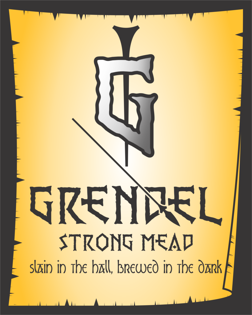
No release date yet — but here’s a preview of some characters in context, and a parody beverage label built as a demonstration of use, named for a certain monster.