Since I first released PR Viking back in 2007, it's kept finding new life — most recently on the packaging of a PS5 game. That kind of staying power is rare, and it got me thinking: what would this font look like if I rebuilt it today, with everything I've learned since?
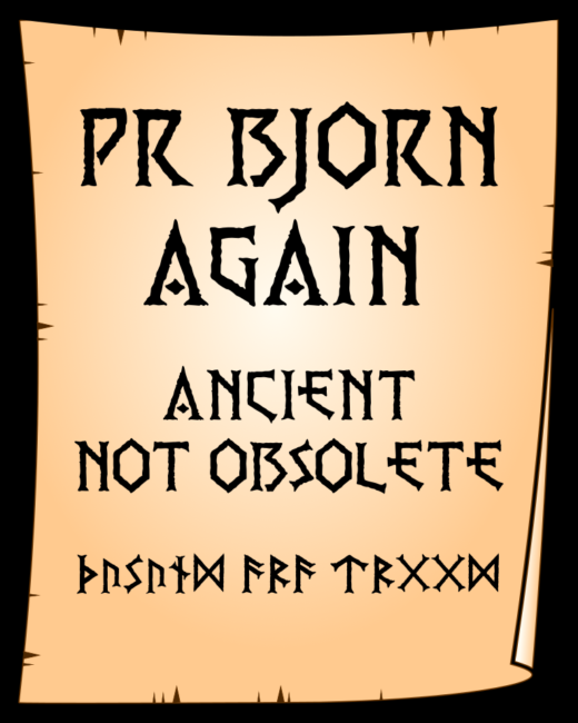
That's Bjorn Again.
It's a drop-in replacement for PR Viking — anything you built with the original will work with this one. But underneath, almost everything is new: the antique texture has been refined for the same weathered effect with a cleaner, more efficient outline. The weaker characters from the original set are gone. And for the first time, the font includes actual Elder Futhark runes, cut with the same serif and texture as the Latin capitals — not bolted on as an afterthought, but built to belong.
New alternate characters are included too, all accessible in a single font file — no more juggling separate files for different looks. One OTF, several faces.
Food, food, food for every possible taste
his font started with a sketch between calls at a call centre, at a time when Conan the Barbarian was top of my reading list. I redrew it on the computer, and morphed it through multiple programs — vector drawing, photo editing, image tracing, font editor — until it looked right. Like something preserved in a bog for a thousand years, but still a recognisable shape. In re-working the character weathering, I have spent hours node editing in multiple passes, adjusting alignment, and fine tuning proportions. I regret nothing.
Coming soon:
full release targeted for late July. If you've used PR Viking before, Bjorn Again will feel instantly familiar — just sharper.