Last time, in “Chips,” I talked about knife work — the deliberate notch, the ellipse or triangle bitten out of a straight edge, three to five per letter and not one more. That’s the whittling end of distressing: subtraction, precision, restraint.
Sprinkles is a different animal. This time we’re not cutting into the letter. We’re rubbing something onto it — or rather, rubbing the letter itself against something rough enough to leave its mark. If Chips is a knife, Sprinkles is sandpaper, salt, and a stub of crayon held on its side.
The lineage
This technique has real pedigree. Anyone who’s studied Trajan’s Column seriously will know Edward Catich’s rubbing work — pressing paper against carved stone and dragging graphite or wax across the surface until the letterforms rise up out of the texture. It’s one of the oldest ways humans have ever copied a letter: not by drawing it, but by revealing it, the way a brass rubbing reveals a tomb effigy, or a leaf print reveals its own veins.
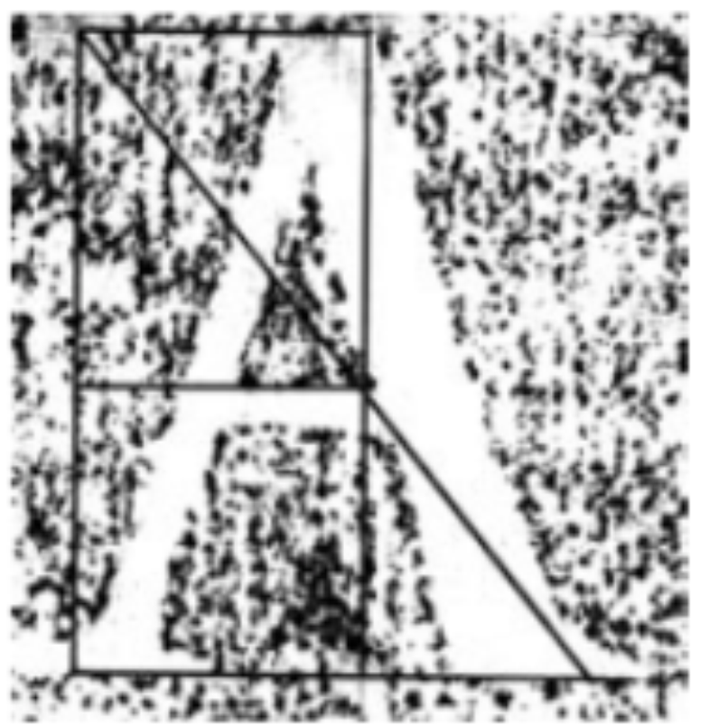
illustration from The Geometry of Roman Lettering by Tom Perkins
Perkins’ own diagram of the rubbing-and-construction method — a reminder that what we’re about to do with card stock and a crayon sits in a real, documented lineage of letterform study, not just a craft-table experiment.
I’m not carving stone tonight. I’m gluing coarse salt crystals to a sheet of card.
Setting up the surface
For this demonstration I built a distressing surface out of ordinary card stock and a generous, uneven layer of pink Himalayan salt — the coarse, crystal kind, not fine table salt, and pink because that’s what I had on hand (it also happens to photograph better than plain white would have, so I’m calling that a happy accident rather than a deliberate choice).
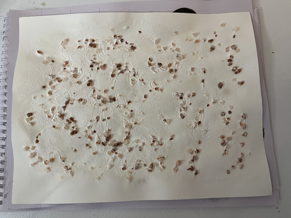
This is the actual rubbing surface — an irregular, chunky scatter of crystal with real height variation, none of it uniform. That irregularity is the whole point. A rubbing surface that’s too regular gives you a pattern, not a texture, and those read completely differently once they’re inside a letterform.
The word for today’s demo is “Rough.” Partly because it says exactly what it is, partly because I liked the idea of the content and the technique agreeing with each other for once.
One practical wrinkle: I don’t happen to own a white crayon, and dark ones are a lot easier to find in this house. So I set the word “Rough” in a white font on a black background, laid the printout over the salt, and rubbed it with a purple crayon — the wax resists where it’s rubbed over a peak, skips where it dips into a valley between crystals. I’ll scan it and simply invert the colours afterward. White-on-black or black-on-white, the salt doesn’t care which way round you scan it. Worth remembering if you ever find yourself standing in front of your art supplies and the “obvious” colour isn’t the one you actually have on hand.
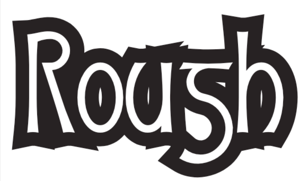
The starting point — the plain font shape before any rubbing happens, so you can see exactly what the texture below is doing to it.
Scanning it in
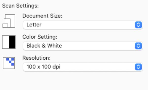
Here’s the setting that matters most in this whole post: resolution deliberately set low, at 100 dpi. More on why in a moment.
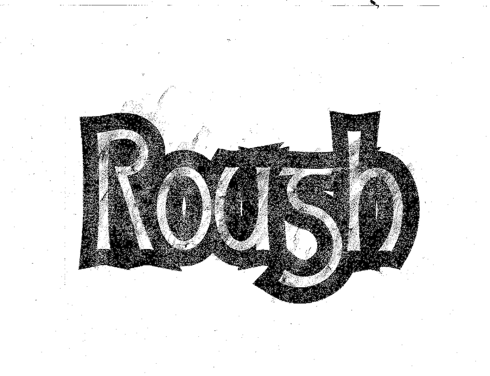
This is the raw scan, straight off the salt surface. Every peak and valley the crayon touched (or missed) is now sitting in this image as texture.
The part nobody warns you about: resolution
Here’s the lesson that cost me some genuine frustration the first time I tried this, and it’s worth saying plainly so you don’t have to learn it the hard way too.
Scan your rubbing at a lower resolution than you think you want.
It feels backwards. Everything else in this hobby says “more detail is better,” so your instinct is to crank the scanner up as high as it’ll go, capture every last grain of salt and every hair-fine crack in the wax. Don’t. A high-resolution scan of a genuinely textured rubbing, run through a vector trace, will hand you back an outline built from well over a thousand nodes for a single letter. That’s not texture anymore. That’s noise wearing a texture costume, and it will fight you every step of the way once you try to actually use the glyph — kerning it, scaling it, even just opening the file without your computer thinking about it for a while.
Scan low. Let some of that fine detail simply not survive the capture. Even at 100 dpi, this particular experiment still gave me a very dense texture — well beyond that “3-5 chips per letter” rule from Part 1. Restraint again, just arrived at from the opposite direction: instead of deciding by hand how much texture to add, you’re letting the scan resolution decide how much texture survives.
Tracing it in Inkscape
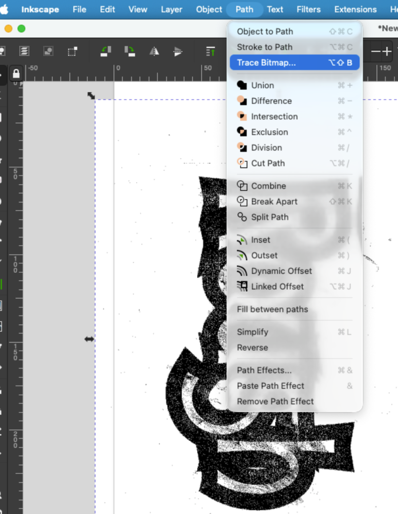
With the scan imported, Path → Trace Bitmap converts the raster scan into vector outlines Glyphs (or any font tool) can actually use. This is the step that turns “a photo of salt and wax” into “editable letterform data.” From here the trace gets rotated horizontal to make working on it easier.
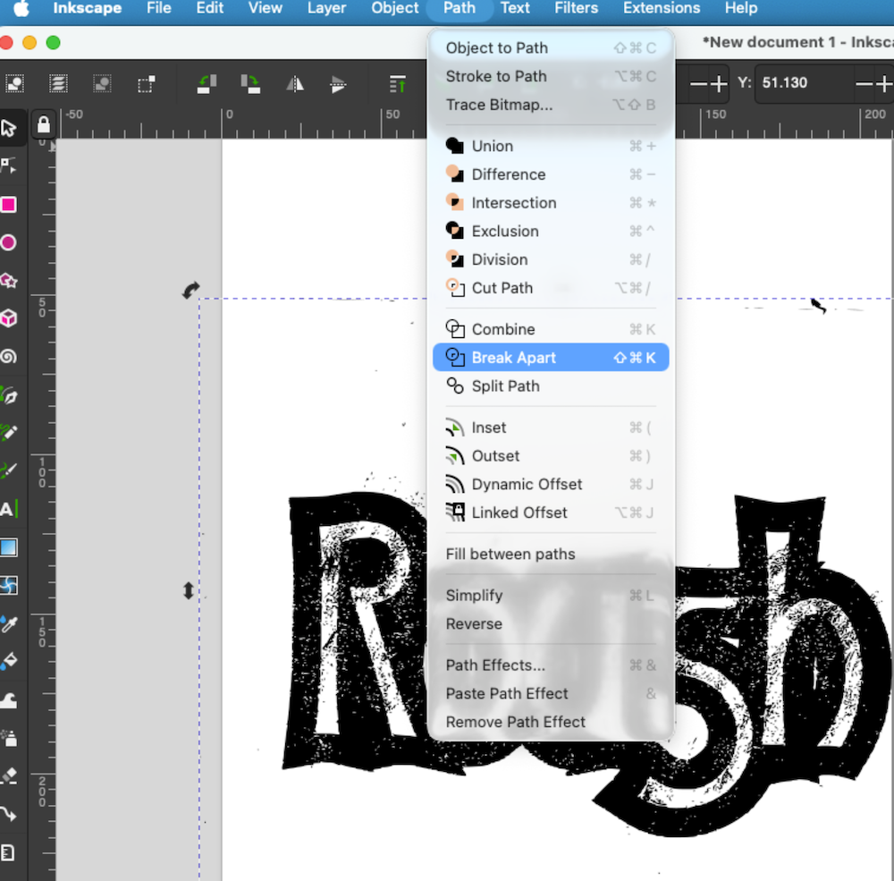
Break Apart splits the trace into its individual separate shapes, making every piece — every fleck of texture, every fragment of a stroke — individually selectable. This is what makes the cleanup pass that follows possible at all.

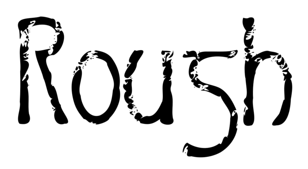
This is what a straightforward trace of the scan looks like before any cleanup: recognizably the word, but carrying every bit of the salt’s irregularity as separate vector detail.
(If the low-resolution scan still comes back busier than you’d like, the fix is the same one I use everywhere else in this process: Inkscape’s Simplify command for a first pass, then going in by hand to decide, node by node, which bumps are actually saying something and which ones are just there. More on that — maybe — in a future instalment, if this one runs long enough without it.)
Reconstructive paleographic surgery
Break Apart is honest about one thing: rubbings don’t always give you a clean, unbroken outline. Sometimes the salt just didn’t catch enough wax in a spot, and a piece of a letter goes missing entirely.
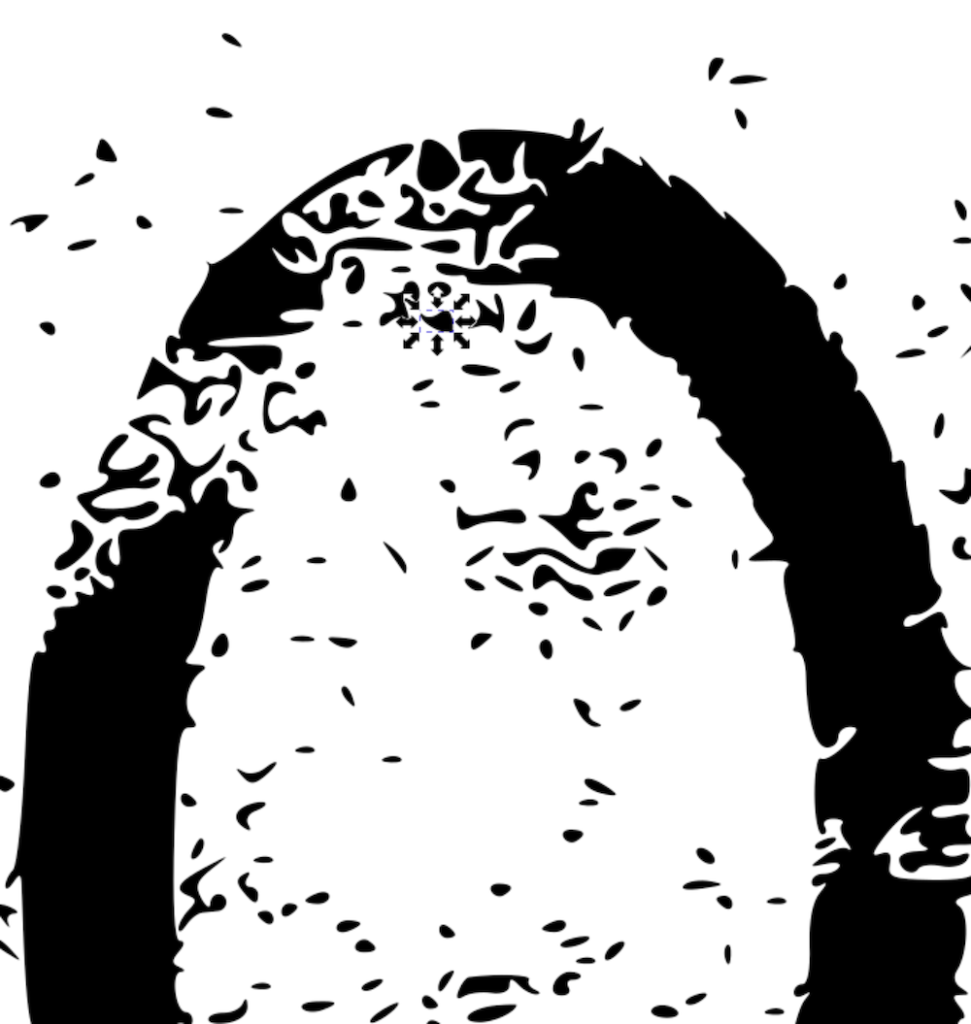
[Image: close-up of the “o,” surrounded by scattered random noise shapes] A detail view of one letter with the loose debris of the trace still sitting around it — flecks and fragments left over from Break Apart that don’t belong to the final form and need to be selected and deleted.
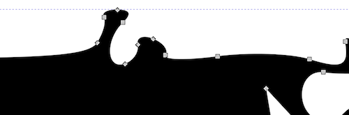
Not everything that needs fixing is extra material sitting outside the letter — sometimes the outline itself has an extraneous bulge where it shouldn’t.
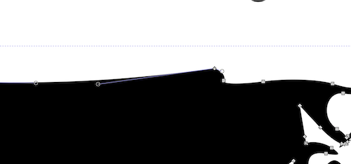
The bulge resolved: the offending nodes deleted, the intervening line made straight rather than carrying that extra swelling forward.
Here’s the part that isn’t shown step-by-step above, because it’s less a repeatable procedure than a judgment call made fresh each time: in a few places, the outline had lost a piece of the letterform entirely — not just noisy, but genuinely missing. Rather than redrawing that section by hand, I went hunting through the pile of stray “noise shapes” Break Apart had scattered around the letter, gathered a handful of them, and stacked them roughly where the missing stroke should be. Then Path → Union welds the pile into one solid mass with the rest of the letter.
It’s an odd way to describe vector cleanup, but it’s the most accurate one I’ve got: it’s almost like reconstructive paleographic surgery. You’re not inventing new material — you’re taking fragments that already exist nearby, on the same page, made by the same rubbing pass, and reassembling them into an approximation of what was always supposed to be there.
How far is too far
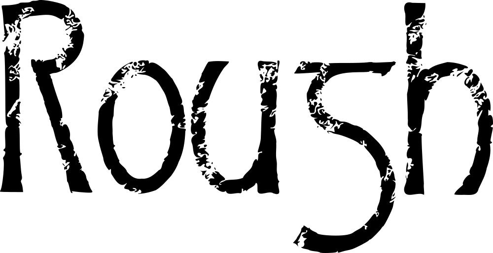
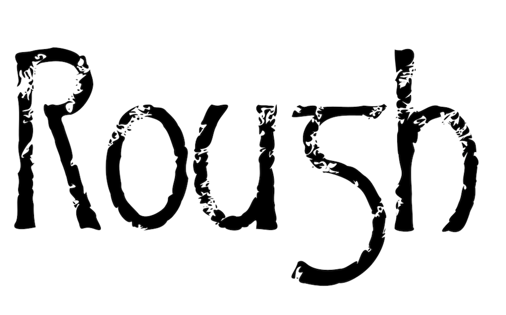
Left to right: the word as traced, one pass of Simplify applied, and — at the far end — Simplify applied one more time, which in my opinion goes too far. The word is still readable in that last version, but the erosion has stopped reading as “rough letterform” and started reading as something else entirely — like limestone pebbles worn smooth in a stream bed. Still legible. Still technically letters. But the font’s own character has washed out along with the noise.
That last version is too distressed for use in an actual font — you’d lose too much of what makes the letterform itself recognizable at small sizes — but it’s genuinely interesting as a one-off headline treatment, where you’re not asking the shape to stay legible across a whole paragraph, just to make a strong first impression.
It’s all up to the look your particular project actually needs. The techniques shown here — rub, scan low, trace, simplify, judge — apply just as well to image outlines generally as they do to letterforms specifically.
Where this is headed
Salt crystals are just one rubbing surface. Sandpaper, at various grits, is next on the list — different grits for different point sizes, the same way you’d choose a different brush for a headline than for body text.
After that, Sprinkles has one more trick in it after it hands off to Salsa: woodgrain. That one’s not a rubbing at all — no crayon, no card stock. It’s two vector images talking to each other instead: a hand-painted background built up with a few different tools, and a separate scan of ordinary coffee grounds, stretched long and thin until it reads as the pores running through a plank of wood. Carve one out of the other, and you get grain that never touched a rubbing surface at all — closer to digital collage than to Catich’s stone. Different enough from everything above that it earns its own explanation when it gets here.
And somewhere further down the road, because Halloween has a way of insisting on itself, there’s still something considerably messier waiting: drips. That’s Salsa’s job. Sprinkles is just here to prove that “rough” doesn’t have to mean “random.” Even a rubbing, even something this close to accidental, still answers to the same question every letter in this foundry answers to: how much is enough, and when do you stop?
A quick aside, the character in the middle of “Rough” that looks like an “s” isn’t one. It’s a lowercase g — specifically a half-uncial g, the form scribes were using centuries before our familiar loop-tailed modern g ever evolved. Our now-standard small g didn’t take shape until roughly five hundred years later. It’s a small, honest reminder of how far letterforms drift over time: a shape that was perfectly legible to an 8th-century reader can genuinely read as a different letter entirely to a 21st-century one.
(If you want to see that range for yourself, PR-Vanaheim gives you both — an archaic lowercase set rooted in exactly this kind of early form, and a modern-flavored alternative, freely mixable so you can dial the authenticity up or down to taste.)
Enjoyed this? The foundry sends occasional notes on type design, historical letterforms, and works in progress.
Join the list — be first to know when new fonts arrive.
Leave a Reply