Like a lot of people my age, I sometimes have to get up in the middle of the night to answer nature’s call — and like a lot of people, I end up spending some time online before I can get back to sleep. Some call this doomscrolling. In my case, I was browsing Etsy for leather products that LARP and Renaissance Faire enthusiasts might buy — if I made one that was beautiful.
One design I’d been fussing over all week was a cylindrical scroll case, fastened with rivets. Getting the rivet spacing right meant a lot of fiddly math, and lining up two pieces of leather so their holes matched on the anvil was a real exercise in physical patience. I’d brought sketches to a Sunday-afternoon park session with a local LARP group, rolled up in a plain cardboard tube — I hadn’t built the leather version yet. One of my contacts there pointed out that some scroll carriers on the market are really just a rectangle of leather, with a string and a weight for closure, slightly larger than the page (or sometimes even a narrower wrap), acting as reinforcement. Way cooler-looking, and much easier to build.
Playing off “doomscrolling,” I landed on a name that sounds like it came right out of the Dungeon Master’s Guide: “the Scroll of Doom”. I already had a color treatment worked out for it — a deep violet purple, shading to near-black at the edges, an obvious fit for something associated with a certain dark sorceress. I’d named it Midnight Purple, and it was clearly the color for this piece.
A bout of insomnia turned into a genuinely productive design session. Keep an eye out — the Scroll of Doom is coming soon to a gaming table or outdoor LARP near you.
In Highlander, there can be only one. It’s a good line for a movie. It’s terrible advice for a craftsman.
I learned this properly on my first tour of North Forge Maker’s Space, led by a member named Robert. He’d already had his own head 3D-scanned as a demo for the photogrammetry and 3D-printing equipment — a small, good-humoured sacrifice to the cause of teaching. As we walked the shop floor, he told me the one rule that has quietly reorganized how I think about making things ever since: never build only one.
“Never make just one,” he said. “And I’ll help you sell the other ten.”
Not because more is always better. Because a single object is a curiosity. A second one is a decision. And a decision repeated is a practice — the beginning of something you can actually offer to other people, instead of a thing that only ever exists once, admired and then shelved.
It’s the inversion of the Highlander mythos, in the most practical way imaginable. There can’t be only one. There shouldn’t be. If it was worth making, it’s worth making again — a little better, a little faster, a little more yours each time.
I’ve paired Robert’s rule with a second one I’ve been living by more informally, one I’ve taken to calling the Way of the Elder Cat: no more complicated than absolutely necessary.
I came to this one watching an actual kitten and an older cat in the same room. The kitten was leaping constantly — launching at a toy, missing, tumbling sideways, looking utterly adorable in the process, but getting nowhere in particular. The old cat just sat there, watching, eyes tracking, occasionally turning his head. Then, without ever standing up, he’d snap one paw out an inch and pin the toy dead still. Same success rate as the kitten, near enough — for a small fraction of the effort.
Where Robert’s rule pushes me to repeat, the cat’s rule keeps each repetition honest — stripped down to what the piece actually needs, nothing bolted on because it seemed clever at 1 a.m.
Left to my own devices, I tend to run more like a kitten — pouncing from one bright idea to the next, delighted and mostly unproductive. Robert’s rule and the cat’s rule together are what turn that scatter into a workshop. One says: don’t stop at one. The other says: don’t make it harder than it needs to be. Between them, an idea actually gets somewhere.
That’s also, I think, why a place like North Forge works the way it does. Robert’s line wasn’t just about production — it was an offer, freely made, to a stranger on his first day. That’s the same goodwill that gets passed around the shop floor every day: someone shows you where the good clamps are, someone else fits you in for five minutes on a machine, someone hands over a tip that saves you an afternoon. It costs nothing to give and it comes back tenfold. I try to pay it forward where I can — sharing a design file, showing a fellow member something of mine that might suit their work, the small trades that keep a workshop feeling like a workshop and not just a room full of machines.
So — this one’s for Robert. Wherever you are in the shop today, you’re still right. And sometimes, you just have to feed the old kitty.
Last time, in “Chips,” I talked about knife work — the deliberate notch, the ellipse or triangle bitten out of a straight edge, three to five per letter and not one more. That’s the whittling end of distressing: subtraction, precision, restraint.
Sprinkles is a different animal. This time we’re not cutting into the letter. We’re rubbing something onto it — or rather, rubbing the letter itself against something rough enough to leave its mark. If Chips is a knife, Sprinkles is sandpaper, salt, and a stub of crayon held on its side.
The lineage
This technique has real pedigree. Anyone who’s studied Trajan’s Column seriously will know Edward Catich’s rubbing work — pressing paper against carved stone and dragging graphite or wax across the surface until the letterforms rise up out of the texture. It’s one of the oldest ways humans have ever copied a letter: not by drawing it, but by revealing it, the way a brass rubbing reveals a tomb effigy, or a leaf print reveals its own veins.
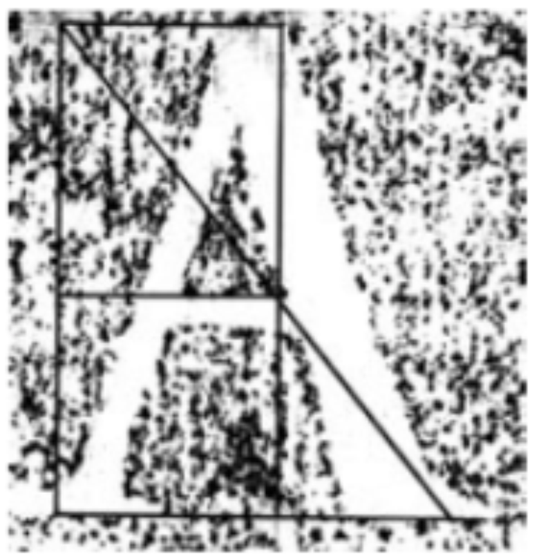
illustration from The Geometry of Roman Lettering by Tom Perkins
Perkins’ own diagram of the rubbing-and-construction method — a reminder that what we’re about to do with card stock and a crayon sits in a real, documented lineage of letterform study, not just a craft-table experiment.
I’m not carving stone tonight. I’m gluing coarse salt crystals to a sheet of card.
Setting up the surface
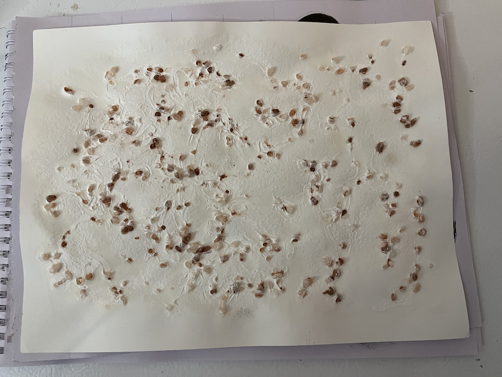
For this demonstration I built a distressing surface out of ordinary card stock and a generous, uneven layer of pink Himalayan salt — the coarse, crystal kind, not fine table salt, and pink because that’s what I had on hand (it also happens to photograph better than plain white would have, so I’m calling that a happy accident rather than a deliberate choice).
This is the actual rubbing surface — an irregular, chunky scatter of crystal with real height variation, none of it uniform. That irregularity is the whole point. A rubbing surface that’s too regular gives you a pattern, not a texture, and those read completely differently once they’re inside a letterform.
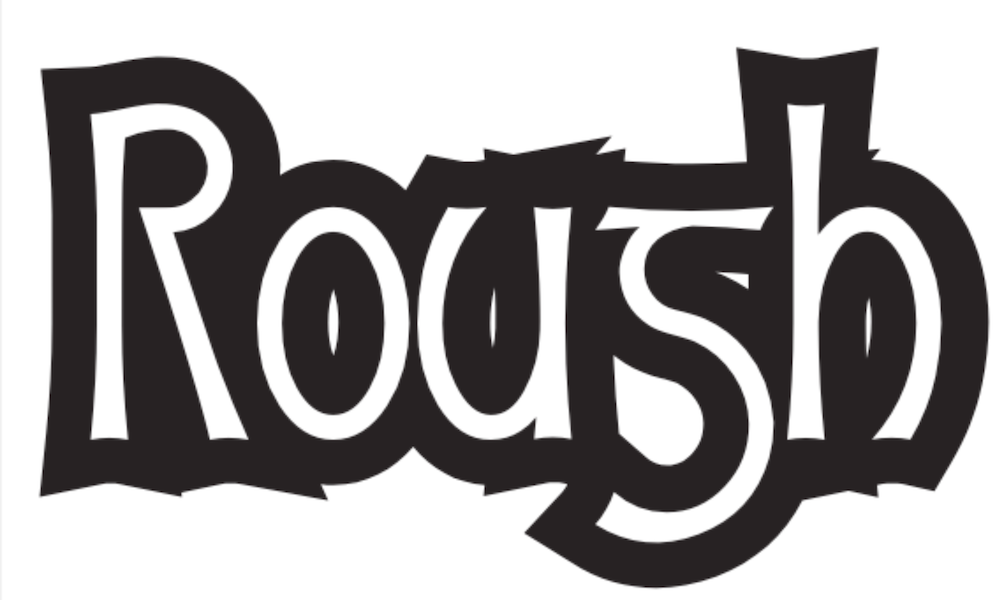
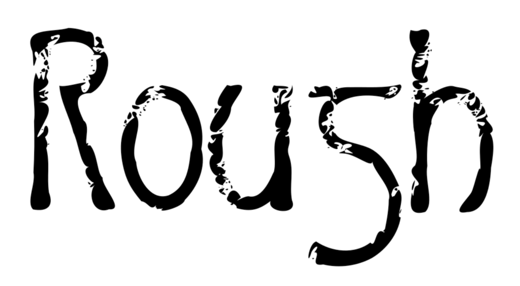
The word for today’s demo is “Rough.” Partly because it says exactly what it is, partly because I liked the idea of the content and the technique agreeing with each other for once.
One practical wrinkle: I don’t happen to own a white crayon, and dark ones are a lot easier to find in this house. So I set the word “Rough” in a white font on a black background, laid the printout over the salt, and rubbed it with a purple crayon — the wax resists where it’s rubbed over a peak, skips where it dips into a valley between crystals. I’ll scan it and simply invert the colours afterward. White-on-black or black-on-white, the salt doesn’t care which way round you scan it. Worth remembering if you ever find yourself standing in front of your art supplies and the “obvious” colour isn’t the one you actually have on hand.
The starting point — the plain font shape before any rubbing happens, so you can see exactly what the texture below is doing to it.
Scanning it in
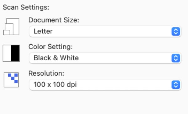
Here’s the setting that matters most in this whole post: resolution deliberately set low, at 100 dpi. More on why in a moment.
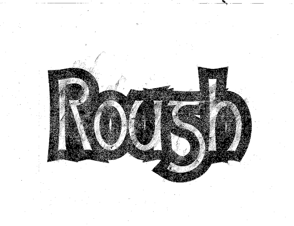
This is the raw scan, straight off the salt surface. Every peak and valley the crayon touched (or missed) is now sitting in this image as texture.
The part nobody warns you about: resolution
Here’s the lesson that cost me some genuine frustration the first time I tried this, and it’s worth saying plainly so you don’t have to learn it the hard way too.
Scan your rubbing at a lower resolution than you think you want.
It feels backwards. Everything else in this hobby says “more detail is better,” so your instinct is to crank the scanner up as high as it’ll go, capture every last grain of salt and every hair-fine crack in the wax. Don’t. A high-resolution scan of a genuinely textured rubbing, run through a vector trace, will hand you back an outline built from well over a thousand nodes for a single letter. That’s not texture anymore. That’s noise wearing a texture costume, and it will fight you every step of the way once you try to actually use the glyph — kerning it, scaling it, even just opening the file without your computer thinking about it for a while.
Scan low. Let some of that fine detail simply not survive the capture. Even at 100 dpi, this particular experiment still gave me a very dense texture — well beyond that “3-5 chips per letter” rule from Part 1. Restraint again, just arrived at from the opposite direction: instead of deciding by hand how much texture to add, you’re letting the scan resolution decide how much texture survives.
Tracing it in Inkscape
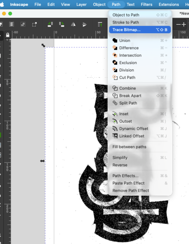
With the scan imported, Path → Trace Bitmap converts the raster scan into vector outlines Glyphs (or any font tool) can actually use. This is the step that turns “a photo of salt and wax” into “editable letterform data.” From here the trace gets rotated horizontal to make working on it easier.
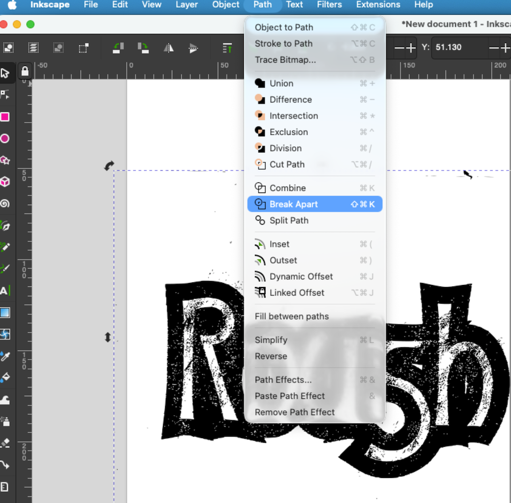
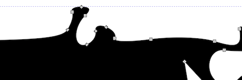
Break Apart splits the trace into its individual separate shapes, making every piece — every fleck of texture, every fragment of a stroke — individually selectable. This is what makes the cleanup pass that follows possible at all.
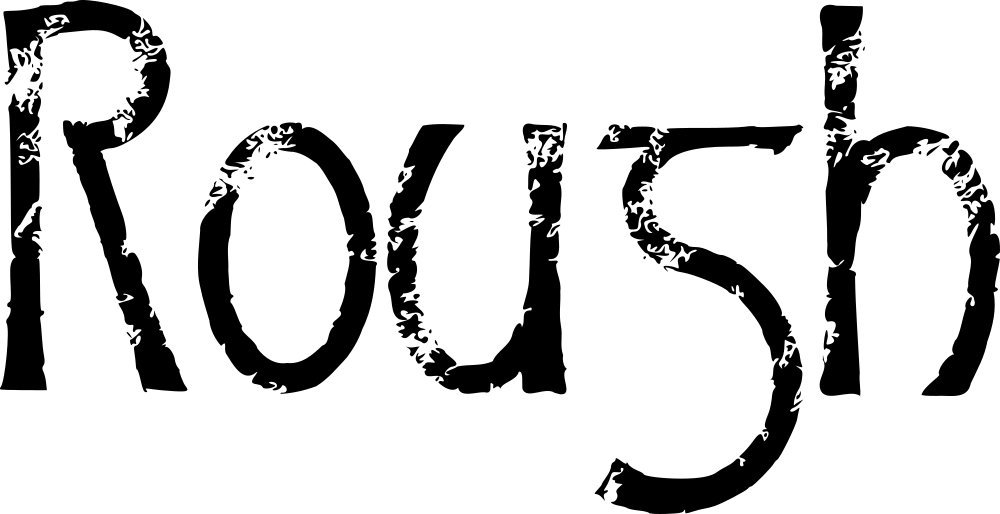
This is what a straightforward trace of the scan looks like before any cleanup: recognizably the word, but carrying every bit of the salt’s irregularity as separate vector detail.
(If the low-resolution scan still comes back busier than you’d like, the fix is the same one I use everywhere else in this process: Inkscape’s Simplify command for a first pass, then going in by hand to decide, node by node, which bumps are actually saying something and which ones are just there. More on that — maybe — in a future instalment, if this one runs long enough without it.)
Reconstructive paleographic surgery
Break Apart is honest about one thing: rubbings don’t always give you a clean, unbroken outline. Sometimes the salt just didn’t catch enough wax in a spot, and a piece of a letter goes missing entirely.
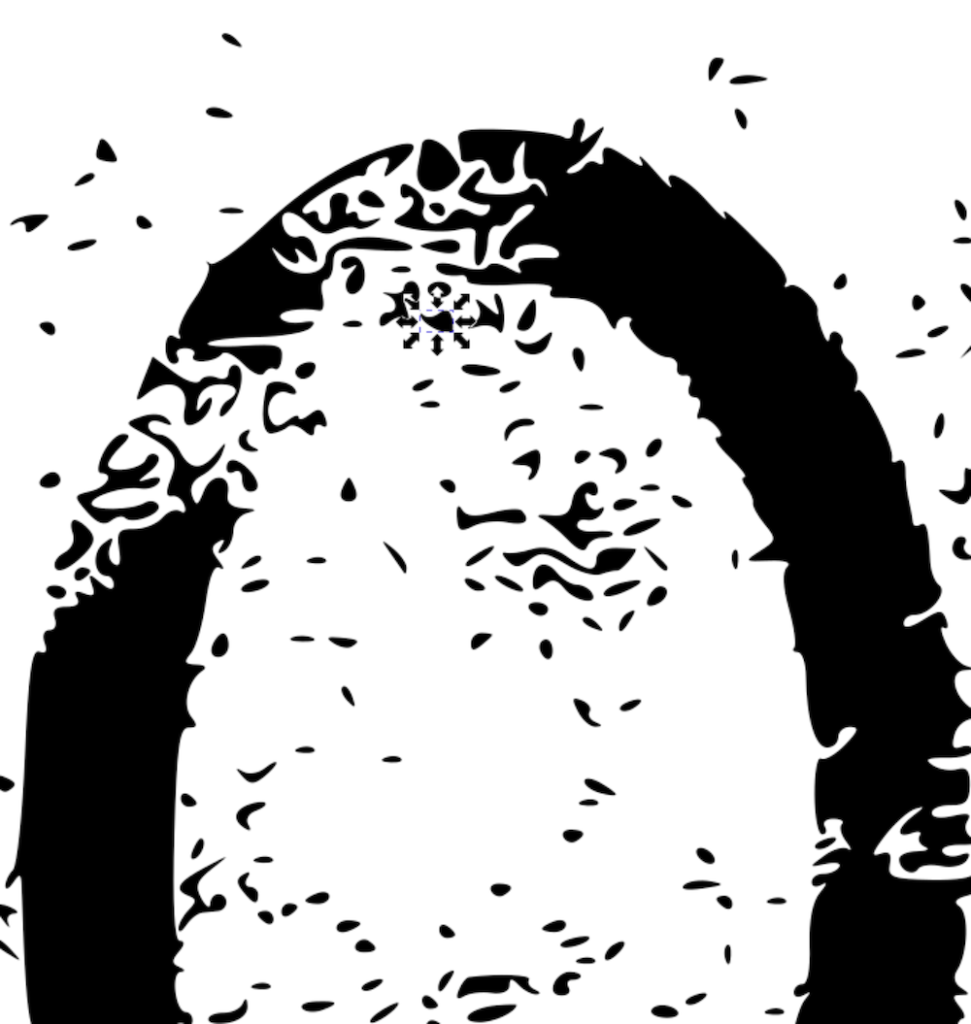
[Image: close-up of the “o,” surrounded by scattered random noise shapes]A detail view of one letter with the loose debris of the trace still sitting around it — flecks and fragments left over from Break Apart that don’t belong to the final form and need to be selected and deleted.
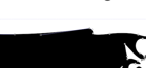
Not everything that needs fixing is extra material sitting outside the letter — sometimes the outline itself has an extraneous bulge where it shouldn’t.
The bulge resolved: the offending nodes deleted, the intervening line made straight rather than carrying that extra swelling forward.
Here’s the part that isn’t shown step-by-step above, because it’s less a repeatable procedure than a judgment call made fresh each time: in a few places, the outline had lost a piece of the letterform entirely — not just noisy, but genuinely missing. Rather than redrawing that section by hand, I went hunting through the pile of stray “noise shapes” Break Apart had scattered around the letter, gathered a handful of them, and stacked them roughly where the missing stroke should be. Then Path → Union welds the pile into one solid mass with the rest of the letter.
It’s an odd way to describe vector cleanup, but it’s the most accurate one I’ve got: it’s almost like reconstructive paleographic surgery. You’re not inventing new material — you’re taking fragments that already exist nearby, on the same page, made by the same rubbing pass, and reassembling them into an approximation of what was always supposed to be there.
How far is too far
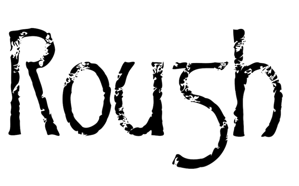
Left to right: the word as traced, one pass of Simplify applied, and — at the far end — Simplify applied one more time, which in my opinion goes too far. The word is still readable in that last version, but the erosion has stopped reading as “rough letterform” and started reading as something else entirely — like limestone pebbles worn smooth in a stream bed. Still legible. Still technically letters. But the font’s own character has washed out along with the noise.
That last version is too distressed for use in an actual font — you’d lose too much of what makes the letterform itself recognizable at small sizes — but it’s genuinely interesting as a one-off headline treatment, where you’re not asking the shape to stay legible across a whole paragraph, just to make a strong first impression.
It’s all up to the look your particular project actually needs. The techniques shown here — rub, scan low, trace, simplify, judge — apply just as well to image outlines generally as they do to letterforms specifically.
Where this is headed
Salt crystals are just one rubbing surface. Sandpaper, at various grits, is next on the list — different grits for different point sizes, the same way you’d choose a different brush for a headline than for body text.
After that, Sprinkles has one more trick in it after it hands off to Salsa: woodgrain. That one’s not a rubbing at all — no crayon, no card stock. It’s two vector images talking to each other instead: a hand-painted background built up with a few different tools, and a separate scan of ordinary coffee grounds, stretched long and thin until it reads as the pores running through a plank of wood. Carve one out of the other, and you get grain that never touched a rubbing surface at all — closer to digital collage than to Catich’s stone. Different enough from everything above that it earns its own explanation when it gets here.
And somewhere further down the road, because Halloween has a way of insisting on itself, there’s still something considerably messier waiting: drips. That’s Salsa’s job. Sprinkles is just here to prove that “rough” doesn’t have to mean “random.” Even a rubbing, even something this close to accidental, still answers to the same question every letter in this foundry answers to: how much is enough, and when do you stop?
A quick aside, the character in the middle of “Rough” that looks like an “s” isn’t one. It’s a lowercase g — specifically a half-uncial g, the form scribes were using centuries before our familiar loop-tailed modern g ever evolved. Our now-standard small g didn’t take shape until roughly five hundred years later. It’s a small, honest reminder of how far letterforms drift over time: a shape that was perfectly legible to an 8th-century reader can genuinely read as a different letter entirely to a 21st-century one.
(If you want to see that range for yourself, PR-Vanaheim gives you both — an archaic lowercase set rooted in exactly this kind of early form, and a modern-flavored alternative, freely mixable so you can dial the authenticity up or down to taste.)
In the 1980s, if you told someone you were learning calligraphy, they assumed you meant one thing: Chancery Italic. It was everywhere. Wedding invitations, church bulletins, the flowing, elegant hand that had somehow become synonymous with “calligraphy” itself, full stop, as if no other style existed or ever had.
I avoided it on purpose.
Not out of contrarianism, exactly — though there may have been a little of that too — but because everyone else was already doing it, and doing it well. What actually caught my eye was something a lot closer to home, literally: the German Bible verses lettered on my parents’ house. Blackletter forms, dense and upright, utterly unlike the swooping italic hand every calligraphy manual seemed to assume you wanted. I didn’t have a name for what I was looking at yet. I just knew it wasn’t what everyone else was chasing, and that was enough to make me curious.
Years later, I learned those forms had names of their own: Fraktur and Schwabacher. Distinct German blackletter traditions, each with their own logic and history, sitting quietly on a house wall the whole time, waiting for me to go looking for the vocabulary.
That’s more or less how I ended up backing into medieval letterforms — not through the front door everyone else was using, but through a side entrance I didn’t know was there.
Uncial, Not Unical
The correction came at a meeting of the Manitoba Calligraphers’ Guild.
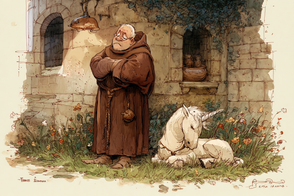
I’d been calling the lettering style on my paperback copy of The Lord of the Rings “unical” for years — as had a few friends, as it turned out, so at least I wasn’t alone in getting it wrong. It’s an easy mistake. Say it out loud and your brain wants to land on unicorn, and honestly, the rounded, faintly mythic-looking letterforms don’t discourage the association. It feels like a word that ought to belong to a world with unicorns in it.
Someone at the Guild set me straight: it’s uncial, not unical. And the real etymology turned out to be better than the accidental one.
Uncial comes from the Latin uncia — meaning a twelfth part, and by extension, a thumbnail, or an inch. The style takes its name from the height at which it was traditionally written: roughly an inch, give or take whatever variation crept in from one scribe’s hand to the next. Which means every scribe who ever wrote in uncial script was carrying their own measuring standard around with them, built into their own thumb. No ruler required. Just a convenient, portable, endlessly available reference, right there at the end of your arm.
I like that a great deal more than unicorns, honestly. Though I understand the appeal of the wrong version too.
Where the Long Way Starts
That correction — one word, gently fixed at a Guild meeting — turned out to be the actual beginning of everything that followed. Not a five-year plan. Not a deliberate decision to study medieval paleography systematically. Just a small, specific curiosity, chasing down why a word meant what it meant, and then chasing the next thing after that, and the thing after that.
I didn’t know it at the time, but that was the first step onto the long road — the one that eventually took me through half-uncials, insular Celtic minuscule, runic carving, black letter, and finally, decades later, to the italic-derived forms everyone else had started with back in the 1980s.
I just took the long way around to get there. As it turns out, that’s kind of become my whole method.
Every craft has its tools, and every tool has an ideal state. A carving knife is meant to hold a clean, unbroken edge. A chisel is meant to bite true, without a chip knocked out of its blade. And type — real type, the letterforms themselves — is a precision instrument too, built the same way: proportioned, balanced, sharp where it needs to be sharp.
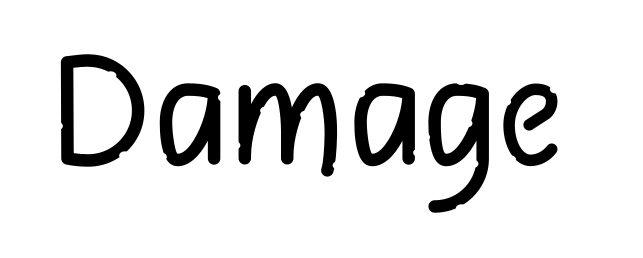
So here’s the question worth sitting with before you distress a single letter: if your best carving knife had one or two notches in the edge, would you call that “character”? Or would you call it damaged, and take it to be resharpened?
I think most of us would reach for the sharpening stone. And that’s exactly the instinct worth keeping in mind the whole time you’re deliberately roughing up a typeface. A little damage reads as history. A lot of damage just reads as broken.
Less Is More (I Learned This the Expensive Way)
I’ll save you the trouble of finding my very first distressing attempt, because I can just tell you: it was overdone. Badly. I got excited about the idea of wear and tear, and I applied it everywhere, generously, on every letter, until the actual forms underneath were fighting to be read through all the damage I’d piled on top of them. It didn’t look aged. It looked like a printing error.
That’s the trap. Distressing is meant to suggest history, not obscure the letter it’s happening to. The moment a reader has to work to figure out what letter they’re looking at, you’ve crossed from “characterful” into “illegible,” and no amount of atmospheric grunge makes up for a word nobody can actually read.
My working rule of thumb now: three to five small chips per letter, on an otherwise clean form. That’s often enough to suggest age and wear without threatening the letter’s own structure. It’s a small number on purpose. You can always add more later if a piece genuinely calls for it. You can’t easily subtract once you’ve buried the letterform under too much noise.
The Simplest Technique: The Notch Itself
If the knife-blade analogy is the philosophy, here’s the technique that makes it literal.
Take a clean, finished letterform — no texture yet, just the pure shape — and cut a small notch directly into an edge. A tiny ellipse, or a small triangle, removed from a stroke the way an actual chip would be knocked out of an actual blade. Do this in two, three, maybe four spots on the letter, chosen where a stroke is thick enough to lose a little material without breaking apart entirely.
That’s genuinely the whole technique. No special tools, no physical media, nothing to scan. Just a boolean subtraction, applied sparingly, directly to the vector shape. It’s the most controlled, most deliberate form of distressing there is — you decide exactly where the “wear” goes, exactly how much, and exactly how it interacts with each specific letter’s structure.
It’s also, not coincidentally, the best place to start learning your own restraint. Before you get into rubbings, textures, and homemade media — all of which introduce an element of chance you don’t fully control — this method lets you practice the judgment call at the center of the whole philosophy: how much is enough, and where does “worn” tip over into “broken”?
Three to five chips. Clean letter otherwise. Resist the urge to keep going once it already reads as aged. That restraint is the actual craft here — the notches themselves are the easy part.
Next Time: Getting Physical
This is the cleanest, most controlled way into distressing, and it’s worth mastering on its own before moving on. But it’s also just the beginning. Once you’re comfortable knowing when to stop, the next installment gets your hands dirty — literally. Rubbing techniques, textured surfaces, and the specific, repeatable process a fifth-century saint would recognize even if the pencil in your hand wouldn’t have made much sense to him.
That’s next time. For now: sharpen the knife, don’t dull it. Three to five chips. Clean letter otherwise.
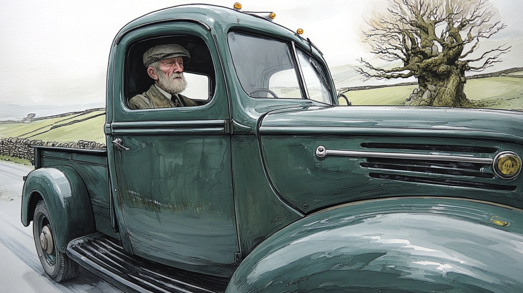
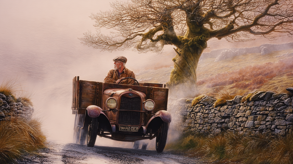
I was building out a character for The Hills of Connemara — my ongoing folk multimedia project — and Fergus needed a vehicle. Simple enough: a green 1940 Ford pickup, the kind of thing a stubborn, self-sufficient Irish-Nordic distiller would drive while outrunning the local excise man on a foggy country road.
MidJourney had other plans. What came back looked older than 1940 — decades older, if I’m honest. My first instinct was to regenerate and try again.
My second instinct was better: what if it’s supposed to look old?
The truck that shouldn’t exist, but does
Maybe Fergus didn’t buy this truck. Maybe he inherited it from his father, and just… kept it running. No carbon buildup, since it runs on his own poitín instead of petrol. More self-sufficient than anything petrol-powered ever was. A truck that’s outlived its era because the man driving it refuses to let it die.
That one small act of not fighting the mistake turned a vehicle into a piece of family history.
Then it kept going
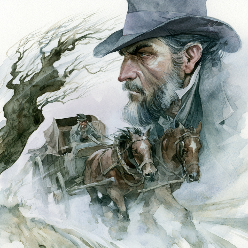
Once Fergus’s truck had a father behind it, it was hard not to ask: what did his father drive? A few generations back, before trucks existed at all, the answer was obvious — a horse and wagon, same road, same tension, same excise man’s ancestor giving chase.
I generated an image of the grandfather: windswept, dark-haired, riding hard, same weathered “here we go again” look on his face as every version of Fergus that came after him. Same road. Same fight. Different century, different technology underneath him.
Three generations. One road. One recurring, deeply unimpressed expression.
Every generation, same complaint
If this were a country song, this is the part where the truck gets a verse of its own — the kind of song that spends three minutes on how much a man loves his pickup before it even gets to the woman he’s singing to. Fergus’s family has the opposite problem: the truck outlasts everyone’s patience for the chase itself. Three generations of “here we go again,” carried across a horse wagon, an ancient Ford, and whatever finally replaces it.
Even Kreena — the one character old enough to have watched all three generations do this exact bit — has stopped being impressed. Her review of the entire multi-century saga is four words long: “It’s just the same.”
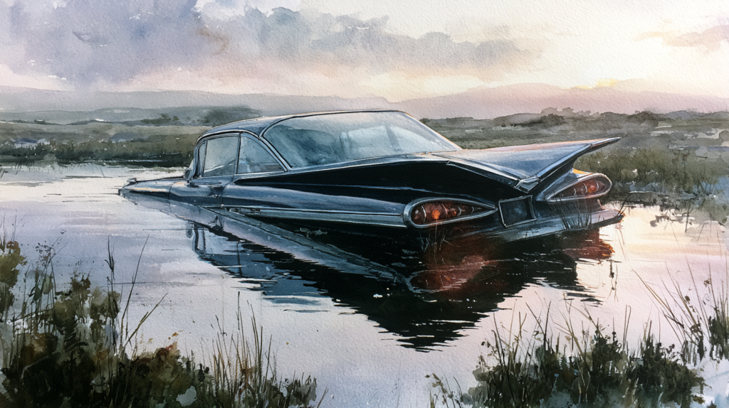
Meanwhile, the actual excise man’s actual car — a 1959 Chevrolet Impala, this generation’s version of the chase vehicle — is already destined for a much less dignified ending than any of Fergus’s family rides: a bog, at a very specific spot on the map, accompanied (fittingly) by banjo music.
Why I’m telling you this on a font foundry’s blog
Because it’s the same lesson I keep relearning at the drawing tablet. A tool “failing” — a font’s swash tail crashing into the next letter, MidJourney handing back the wrong decade of truck — isn’t always a problem to force back into line. Sometimes it’s pointing at something better than what you originally asked for, if you’re willing to follow it instead of fighting it.
I didn’t plan three generations of the same joke. MidJourney got a date wrong, and the rest followed because I let it.
I regularly listen to the podcast ‘Idiot of the Week’ with hosts Francis and Angela. Their frequent contributor goes by ‘Donny, the Dumbfinder.’ Before reading his emails, the hosts would deliver a spoken fanfare: ‘Ta Tata Taah!’ It was playful, memorable, and perfectly captured the comedic energy of the show. I thought: Donny deserves an actual musical fanfare. So I decided to write one.
I started with Elgar’s ‘Pomp and Circumstance’ march no 1 as inspiration. That familiar, pompous march, familiar from graduation ceremonies, felt perfect for a character finding stories about people doing ‘not brilliant’ things. But I needed to make it my own.
I started with rhythm, not melody. I remembered a fanfare rhythm—possibly from Saturday morning cartoons—that matched their spoken ‘Ta Tata Taah!’ I waved my hands in the air, beating time like a conductor, figuring out exactly on which beats the notes fell. Once I had that one-bar flourish, It would lead directly into the march.
For instruments, I chose French horn and tuba—not the brilliant members of the brass section. French horn for melody, tuba for bass. Why? Because the subject matter was finding stories of people doing things that weren’t brilliant. The orchestration should match the tone.
I worked in the key of C— just easier to transpose later, if needed. I started the fanfare on the third of the chord: E, with quick staccato notes up the C chord and down the G. Then I built an 8-bar march section with a conventional harmonic progression: I-V-I-ii-V-I. Not complex, but solid.
I started with 3 horns and tuba, treating them like 4-part vocal harmony. But when I played it back, it was too dense. I cut the 2nd and 3rd horns, leaving just melody and bass, with a bass drum roll at the start and a steady half-note pulse. Simple and clean.
I sent it to Francis and Angela. They loved it—they responded within hours, which was unusual (they normally take 2-3 weeks!- They get a LOT of email, but respond to it all). But they had one request: Could it be more upbeat and louder?
Their feedback was simple: more energy, more volume. Here’s what I changed:
I created versions at 90, 100, 110, and 120 BPM. At 120, it became a more exuberant, celebratory march. Faster tempo = more energy.
I doubled the horn melody up an octave on trumpet and down an octave on bass trombones. It was still just melody and bass, but now with more presence. I also swapped the tuba for a cimbasso—Essentially a contrabass trombone, but with valves instead of a slide. It plays the same range as the tuba, but with a punchier, more focused tone.
For the intro, I replaced a simple crescendo on the bass drum with a staggered drum entrance: bass drum on beat 1, floor tom on beat 2, high tom on beat 3, snare on beat 4. Then snare on beats 2 and 4 with 16th-note rolls. It created energy and momentum.
Making the tempo faster also made it shorter. Repeating the same 8-bar section in the same key felt boring. So I modulated: I-ii-V-I, a new key for each repetition of the tune. The melody notes at the end of the first phrase needed to transition smoothly into the new key. Not the most complex composition, but it served its purpose: background music for a podcast, not a concert piece.
When I played it back, I thought it sounded like a high school band at a football halftime show. My sister said it sounded like a Mardi Gras parade. Either way, it had energy. It had presence. It sounded like exactly what a podcast about finding dumb stories needed.
The finished march was about 90 seconds.
This project taught me something important: feedback improves everything. Francis and Angela’s simple request—’more upbeat, louder’—led to specific technical decisions that made the piece better. As composers, we often think we know what’s best. But our collaborators, our audience, our users—they hear things we don’t. They know what they need. Listening to them makes us better.
Listen to the Sir Donny fanfare when it airs in “High, Dry, and Dangling:” episode of ‘Idiot of the Week.’ Tell us what you think. What did you hear? Did it remind you of anything? Your feedback shapes future compositions.
They used it in the May 25 Episode:
High, Dry, and Dangling: A Masterclass in Bad Decisions, 25 May 2026
In that episode, they had four stories, all from Sir Donny, and they played the opening of my fanfare each time.
On the first story:
“Today’s Idiot of the Week is brought to you by… Flourish
Sir Donnie the Dumb Finder.
Ta-da!
Thank you, that was made by Peter, Peter R.
Thank you, Peter.
Well, you know what? We have a community up in here.
We have a community, an army, people fighting stupid.”
One day, I’m going to win the lottery. I’m going to get some money and I’m going to have a crier.
I swear to you, I’m going to have somebody who announces me and then announces everyone who comes in my presence.
I want more than anything, with long horns.
May it be, I mean long horns and flags.
Totally. Absolutely. I’m here for it.
I’m here for 24 7. And I mean people who live in the house. Announcing: “Your dog Twombly!”
And I’m going to come in with a lute in a Jester’s outfit every afternoon.
You just play in the lute in the corner…
I want you in a Jester’s outfit.
Dancing around like a fool.”
From Frangela: Idiot of the Week: High, Dry, and Dangling: A Masterclass in Bad Decisions, 25 May 2026
What else could I do? I had just had my music played, four times, in a 30 minute show. I don’t know how many people listen to the audio podcast, but more than the eleven hundred paid subscribers to their YouTube channel, who are only the tip of the iceberg
I try to do some composition every day, so I turned my efforts to fulfilling Angela’s wish, and something for Frances too. In the classic chemistry of comedy duos. Angela is very deadpan, and Frances, a little older, for which Angela ribs her mercilessly, making a ten year difference sound like a hundred and fifty.
I wrote something short (about 15 seconds) for each of them, and sent the following email:
Dear Frangela,
Attached you will find three pieces of music, composed with great affection and — I hope — some accuracy of character.
The suite consists of:
Sir Donny’s Flourish
— An 18-second cut with a clean cadence, ready for the producer to drop in whenever Sir Donny shares a story.
FRANFARE
— A fanfare for Frances. You will notice it has the energy of a 1960s game show theme, which I make no apology for. You will also notice a Taiko drum sitting in with both, the renaissance brass and the blues horns. This felt entirely correct. Frances, I understand Japan is on the horizon — consider this a musical preview. Konichiwa, y’all!
I actually took Taiko lessons for a few months, about thirty years ago. The drums have a great booming tone, being made from whisky barrels almost as tall as Frances. They also have an amazing delicate, but carrying rimshot tone, almost like a stage whisper. If you listen real close to the blues band, you can hear the tappy tap on the rim of the taiko, along with the ride cymbal
LADY ANGELA’S Pavanne
A rather more stately affair, because some of us carry our dignity with us at all times. You asked for something with long horns and flags, so I tried to write something that might be at home the court of Elizabeth I. Announcing: “Lady Angela, … of the Detroit Sheltons”
Whether these find their way onto the podcast or not is entirely up to you — no expectation attached, only the hope that they bring a smile.
Your wish was my command. It was a genuine pleasure to fulfill it.
When Johannes Gutenberg introduced moveable type into Europe between 1450 and 1455, he didn’t invent something entirely new—he created a practical solution. His black letter typeface mimicked the handwritten church manuscripts of his day. Smart move. Why? Because people recognised what they already knew.
But here’s the thing: medieval letterforms didn’t just appear fully formed. They evolved. Around the sixth century, monks started turning sharp angles into curves because curved letters could be written faster. That style became uncial (Latin for “one inch high”). By the eighth century, they compressed those letters vertically to fit more text on expensive parchment. Half uncial was born. Efficiency drove design. Still does.
The most notable manuscripts came from Ireland and Scotland—places where the writing system was already influenced by runic forms. Those narrow, angular shapes left their mark on everything that followed.
Medieval fonts carry weight. Literally and symbolically. They’re closely associated with sacred texts, which makes them perfect for:
✓ Religious and seasonal applications (especially Christmas)
✓ Historical and fantasy media (movies, games, documentaries)
✓ Branding that needs gravitas and authenticity
✓ Anyone who wants to say “this matters” without saying it
✓ Design that steps outside the default sans-serif world
In 2026, we’re seeing a resurgence of interest in historical aesthetics. People are tired of the same clean, minimal look everywhere. Medieval fonts offer an alternative. They’re distinctive. They carry story.
Why Medieval Fonts Matter Today
Enter Primer
My approach to Primer is different from the heavy, ornate medieval fonts you typically find.
Primer is based on the Italian Cursive hand—introduced for everyday communication within the Papal Offices between 1420 and 1447. Think about that: this wasn’t sacred script. This was practical writing. The Papal bureaucrats needed something faster to read and write than dense, difficult black letter. They created something elegant but accessible.
If you rendered that Italian Cursive today with a pencil or pointed-tip marker, Primer is what it would look like. You are reading it now.
The result: Easy to read, with understated renaissance elegance. Medieval enough to feel intentional. Modern enough to actually work in contemporary design.
This design also serves as a foundation for future variations that are more obviously medieval in their aesthetic. But Primer? Primer is the bridge.
Primer Caption is the free version. Totally free. For personal and commercial projects. No restrictions.
But the full story? That’s where things get interesting.
We’re developing professional versions designed specifically for designers who need more. These aren’t just expanded character sets. They’re complete typographic solutions with:
✓ Full language support (West European, Cyrillic, Greek)
These professional versions are paid releases. Here’s why:
Paid versions fund continued development. They support the time invested in thoughtful design, extensive testing, and professional-grade kern pairs. They also ensure that designers who rely on these fonts for commercial work are getting tools built specifically for professional use.
It’s not just about features. It’s about sustainability. Quality fonts require investment. Your investment in Primer professional means I can invest in making it better.
The Bigger Picture
Primer
is just the beginning. Here’s what’s planned:
Primer Professional
Alternate characters, cap and lowercase ligatures, variable axes for weight and ascender length, staged multi-language releases.
El Sabio
Calligraphic and monoline variants, inspired by the 13th-century court of Alfonso X. Multiple weights with variable ascender curve and angle. Free introductory release coming.
ChristVesper
Gothicised Italic with companion resources for page layout and illumination. Planned release before Christmas 2026.
PR Plague
Related to ChristVesper, with multiple degrees of distressing. Referencing the Black Death pandemic that swept Europe starting in 1346.
Ragnar
Aggressive Runic-based display font with distinctive spiky serifs.
Extended Nordic and Celtic families
Drawn from history and legend — Viking warlords, Arthurian characters, and the Women of Avalon. More details as development proceeds.
Poitin
— I am creating a font, free for early subscribers. It is called PR Poitín — pronounced “pot CHEEN” — named for the traditional Irish mountain whiskey, known in certain American hollows as Mountain Dew. Sign up at getmedieval.net any time between now and the end of July 1st. Still being brewed, and it will be delivered by email as soon as it is ready to serve. Even digital moonshine deserves good company. Come back next week for a wee dram!
Full Development plans & Family Specifications
Will be published after the Canada Day launch.
Your Voice in Development
But here’s what matters most: You help shape what comes next.
Feedback from Primer Caption users directly influences priorities for professional releases. What features do you need? What languages? What design problems are you trying to solve?
This isn’t a one-way conversation. It’s a partnership. You use Primer. You tell me what works and what doesn’t. I build what you actually need.
That connection—between designer and user—that’s what makes fonts better. Not assumptions. Not trends. Real feedback from people doing real work.
So download Primer Caption. Use it. Tell me what you think. Your voice shapes the future of this font family.
Download Primer Caption (FREE)
[Download from DaFont.com] or [Download from GetMedieval.net]
Try it. Use it. Tell me what you think.
Because the best fonts are the ones people actually use—and the feedback you provide shapes what comes next.
Interested in Professional Features?
Join our mailing list for updates on Primer Professional and other releases. First to know about new fonts, features, and exclusive releases.
About Primer
Primer is designed for:
Web projects that need historical authenticity
Branding that requires gravitas
Digital publishing with style
Print materials that stand out
Anyone tired of the same twelve fonts on every website
PR-Primer draws from the Renaissance Italian cursive tradition — the hand that bridged medieval manuscript culture and the first roman typefaces. Clean, readable, and historically grounded, it sets body text with the warmth of a written page.