In the 1980s, if you told someone you were learning calligraphy, they assumed you meant one thing: Chancery Italic. It was everywhere. Wedding invitations, church bulletins, the flowing, elegant hand that had somehow become synonymous with “calligraphy” itself, full stop, as if no other style existed or ever had.
I avoided it on purpose.
Not out of contrarianism, exactly — though there may have been a little of that too — but because everyone else was already doing it, and doing it well. What actually caught my eye was something a lot closer to home, literally: the German Bible verses lettered on my parents’ house. Blackletter forms, dense and upright, utterly unlike the swooping italic hand every calligraphy manual seemed to assume you wanted. I didn’t have a name for what I was looking at yet. I just knew it wasn’t what everyone else was chasing, and that was enough to make me curious.
Years later, I learned those forms had names of their own: Fraktur and Schwabacher. Distinct German blackletter traditions, each with their own logic and history, sitting quietly on a house wall the whole time, waiting for me to go looking for the vocabulary.
That’s more or less how I ended up backing into medieval letterforms — not through the front door everyone else was using, but through a side entrance I didn’t know was there.
Uncial, Not Unical
The correction came at a meeting of the Manitoba Calligraphers’ Guild.
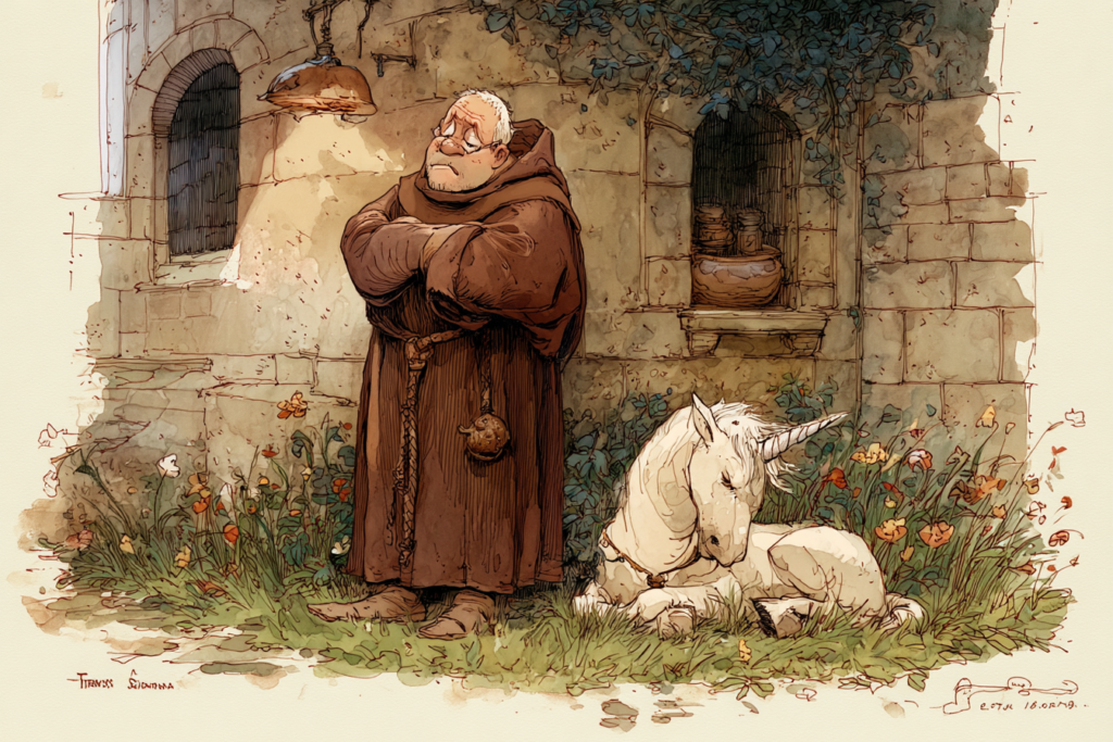
I’d been calling the lettering style on my paperback copy of The Lord of the Rings “unical” for years — as had a few friends, as it turned out, so at least I wasn’t alone in getting it wrong. It’s an easy mistake. Say it out loud and your brain wants to land on unicorn, and honestly, the rounded, faintly mythic-looking letterforms don’t discourage the association. It feels like a word that ought to belong to a world with unicorns in it.
Someone at the Guild set me straight: it’s uncial, not unical. And the real etymology turned out to be better than the accidental one.
Uncial comes from the Latin uncia — meaning a twelfth part, and by extension, a thumbnail, or an inch. The style takes its name from the height at which it was traditionally written: roughly an inch, give or take whatever variation crept in from one scribe’s hand to the next. Which means every scribe who ever wrote in uncial script was carrying their own measuring standard around with them, built into their own thumb. No ruler required. Just a convenient, portable, endlessly available reference, right there at the end of your arm.
I like that a great deal more than unicorns, honestly. Though I understand the appeal of the wrong version too.
Where the Long Way Starts
That correction — one word, gently fixed at a Guild meeting — turned out to be the actual beginning of everything that followed. Not a five-year plan. Not a deliberate decision to study medieval paleography systematically. Just a small, specific curiosity, chasing down why a word meant what it meant, and then chasing the next thing after that, and the thing after that.
I didn’t know it at the time, but that was the first step onto the long road — the one that eventually took me through half-uncials, insular Celtic minuscule, runic carving, black letter, and finally, decades later, to the italic-derived forms everyone else had started with back in the 1980s.
I just took the long way around to get there. As it turns out, that’s kind of become my whole method.
Enjoyed this? The foundry sends occasional notes on type design, historical letterforms, and works in progress.
Join the list — be first to know when new fonts arrive.
Leave a Reply